CLIENT
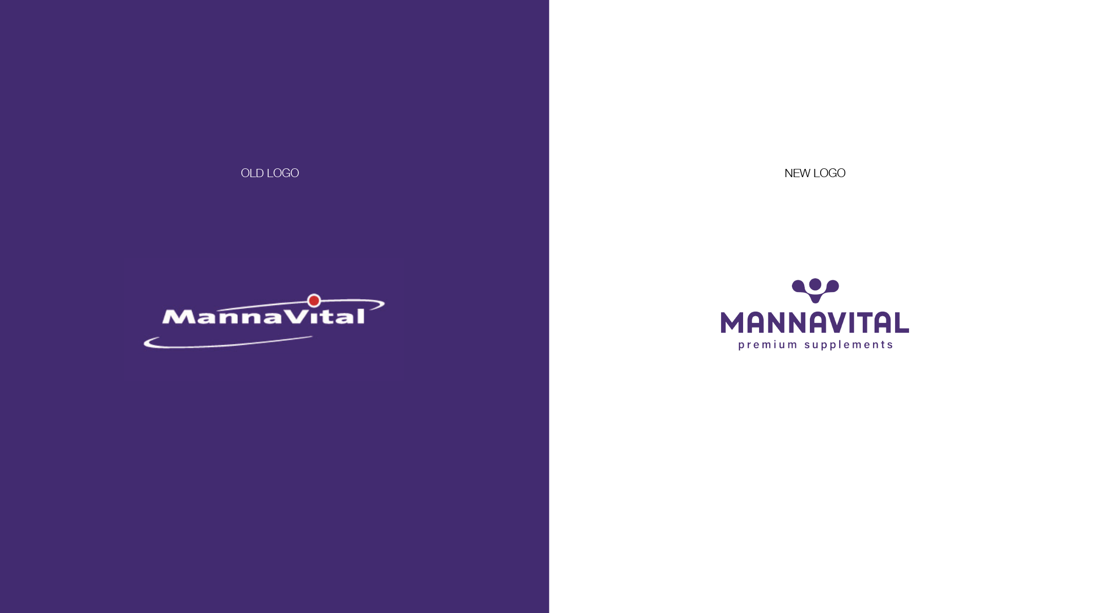
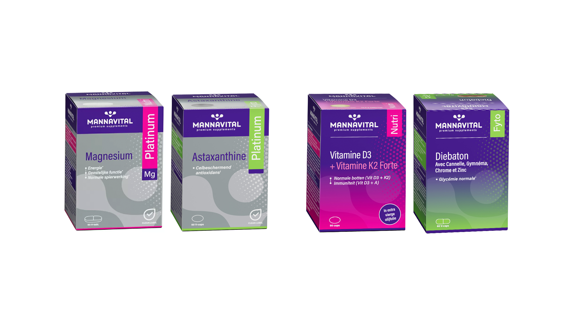
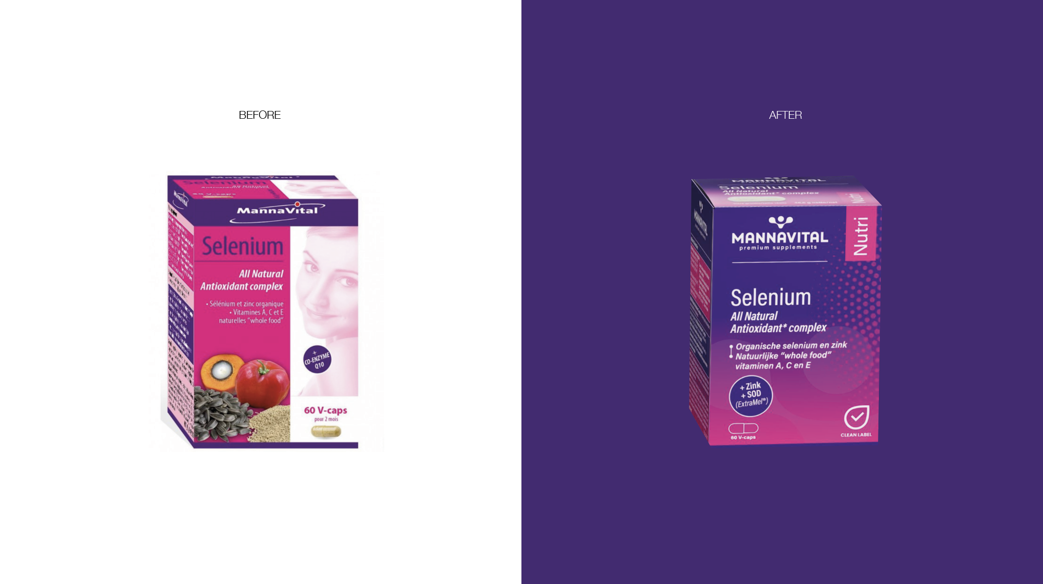
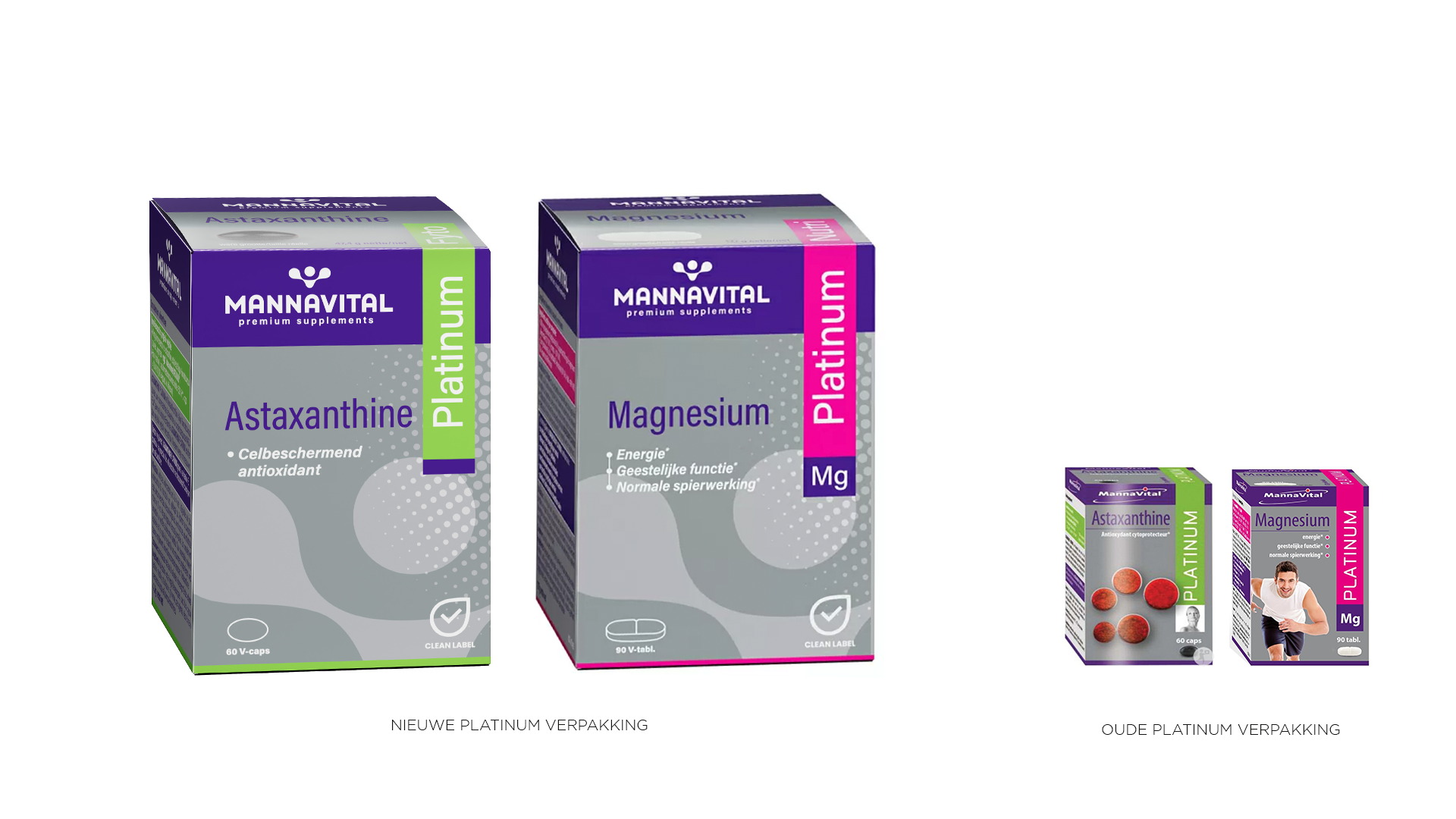
Mannavital is a well known Belgian producer of natural health supplements with a long family heritage and a wide, multi-range product portfolio. Over the years, the packaging system had grown organically, creating a complex visual ecosystem that lacked clarity and structure.
CHALLENGE
The challenge was twofold: bringing clarity to a highly complex, multi-range product portfolio while balancing different expectations around how far the brand should evolve. The goal was to introduce more structure, logic and visual coherence, while still preserving the familiar cues that long-time customers recognised and trusted.
RESULT
I developed a modernised identity that stayed true to Mannavital’s roots while improving visual organisation. The refined colour system, updated logo and unified packaging architecture strengthened consistency across product families, improved shelf navigation and created a more professional brand presence that both generations of stakeholders embraced.