Your brand deserves more than just nice visuals.
It deserves instant adoration, the kind of brand energy people feel, love and remember.
Brand clarity isn’t luck. It’s structure.
You need a visual communication system that make your brand understandable, memorable and easy for people to connect with.
We look at your brand DNA and define your brand ’s core, audience, perception, competitive landscape and the opportunities hidden in between.
DISCOVER
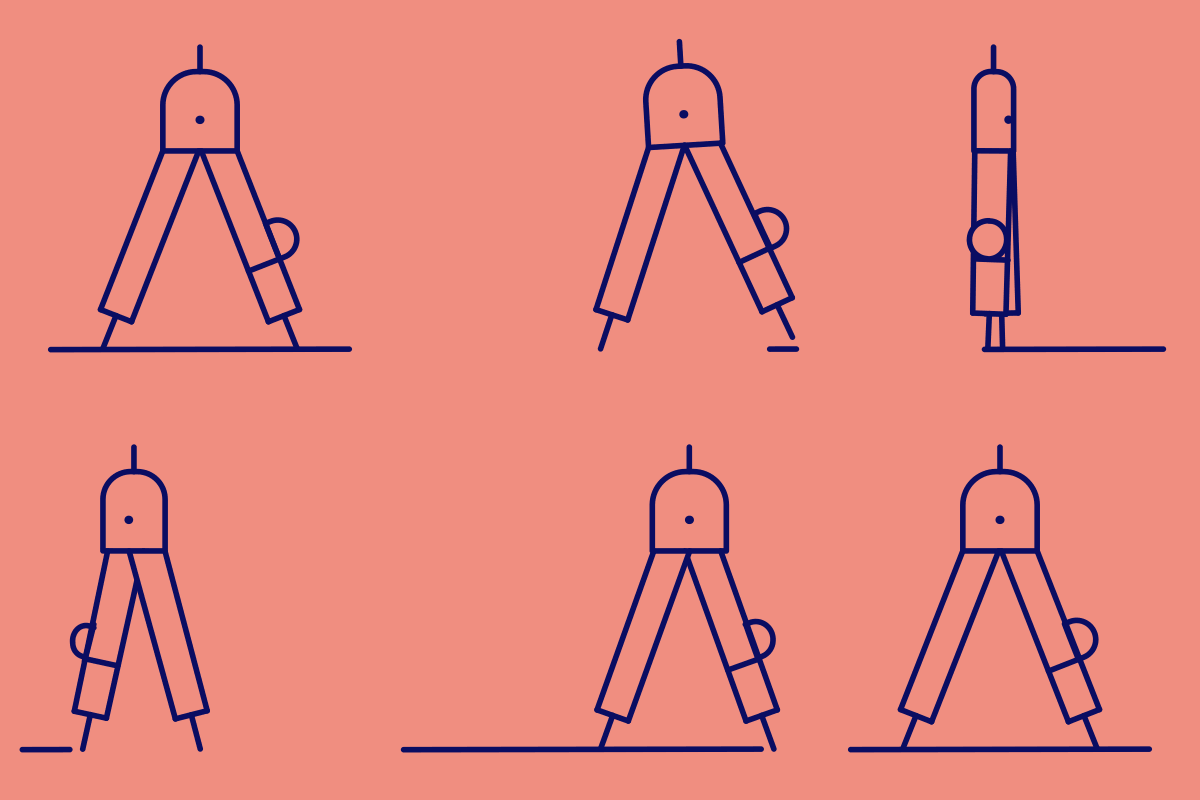
We map out your brand’s true direction, refining positioning, messaging and visual cues with the precision of a compass, so every step that follows is clear and intentional.
DEFINE
DESIGN
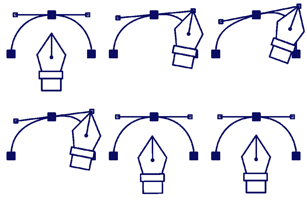
I create a distinct visual identity system; logo, typography, colour, imagery and assets built to scale and make your brand consistent & unmistakable.
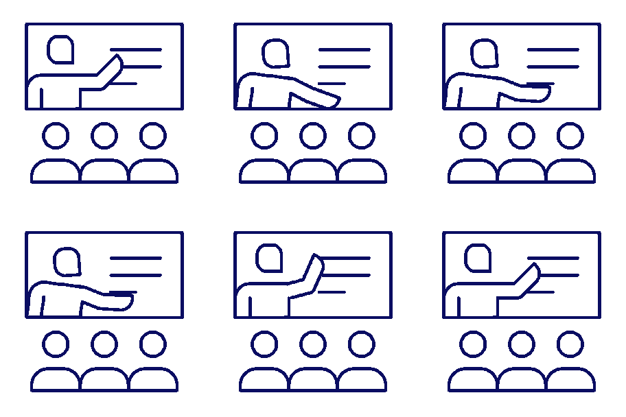
I provide graphical assets, guidelines and implementation support. This way your brand lands with impact and stays consistent across every touchpoint
DELIVER
CASE IN SPOTLIGHT
LOGO DESIGN • BRAND DESIGN • PACKAGING DESIGN • PRODUCT RANGE DESIGN
iVisual for Mannavital
Challenge
Mannavital is a well-established player in Belgium’s supplement market, with a broad portfolio trusted by both consumers and professionals. That strong position also came with a challenge. As the product range expanded over the years, the visual language across different lines began to drift apart. Recognition remained high, but the cohesion and contemporary clarity a growing brand needs were no longer fully there.
The question was simple but demanding. How do you bring structure, freshness and modernity to a brand with such deeply rooted visual equity, without losing the trust and familiarity it has built over decades? The brief called for an evolution that honours the past while setting a clear direction for the company’s next chapter.
Result
The outcome is an identity that balances heritage with a more contemporary expression. The brand’s visual strengths were retained but refined and clarified, creating a system that feels consistent, clean and future-ready. The colour architecture was reorganised, visual nuances were streamlined and the logo received an update that makes the brand feel both fresher and more reliable.
The new design system now brings logic and cohesion across all product lines, guiding customers more intuitively through the range. The packaging feels modern, clearer and more focused, while preserving the recognisable Mannavital character.
BRANDING & DESIGN SERVICES
LOGO DESIGN & VISUAL IDENTITY
BRANDING & VISUAL SYSTEMS
STOREFRONT & FAIR BOOTH DESIGN
DATA VISUALISATION & PRESENTATIONS
PRODUCT PACKAGING DESIGN
DESIGN AUDITS, COACHING & CONSULTANCY
MARKETING ASSETS & PRINT MATERIAL
WEBDESIGN, UI INTERFACE & UX
AI TOOLS & PROMPTING GUIDANCE
OTHER CLIENTS
Artistic Insight
THE THREE PILLARS BEHIND MY WORK
I grew up in the world of fine arts, where ideas matter as much as visuals. That background still shows up in my work, in the way I shape concepts, translate emotions and build identities that feel intentional instead of accidental.
Technical Mastery
Beautiful things fall apart if they’re not built well.
So yes, I obsess over print specs, colour behaviour and production quirks. It’s the unsexy side of design, often misunderstood and underrated, but it’s what makes a brand go from ‘meh’ to ‘wow’.
Marketing & Behavioural Insight
Design isn’t just “pretty”; it’s psychology wearing a designer outfit. I look at how target audiences think, choose and trust, and I use that to create identities that look good and quietly influence what people do.
First-Concept Confidence Guarantee
You only commit once you see a direction that feels right, no risk, no pressure, just clarity and confidence from the start.


